
Most people assume laptop screens are largely interchangeable. Pick any thin, light machine and you get roughly the same visual experience. That assumption collapses the moment you sit in front of a MacBook. The question of why MacBook displays attract attention is not just about raw specifications. It covers hardware engineering decisions, color science, software integration, and the way human perception responds to precision-calibrated screens. This article breaks down each of those layers, giving you a clear picture of what Apple is actually doing differently and why it registers so clearly to the eye.
Table of Contents
- Key Takeaways
- Why MacBook displays attract attention: the hardware behind it
- How Apple’s color science shapes what you see
- MacBook screens versus other laptop displays
- Practical decisions for MacBook buyers and daily users
- My take on what actually makes MacBook screens different
- Protect what your MacBook display reveals
- FAQ
Key Takeaways
| Point | Details |
|---|---|
| Hardware specs matter | Liquid Retina XDR reaches 1,600 nits peak brightness with thousands of local dimming zones for genuine HDR. |
| Color science is deliberate | Apple CMF 2026 and factory calibration deliver color accuracy that most laptop screens skip entirely. |
| Design and software align | True Tone, nano-texture glass, and macOS work together to create a consistent and comfortable visual experience. |
| Settings affect sharpness | macOS scaling choices directly influence text clarity; HiDPI settings preserve the sharpest output. |
| Privacy follows visibility | A screen that draws attention in public also exposes your work to others nearby. |
Why MacBook displays attract attention: the hardware behind it
Not all brightness is equal. A screen that hits 400 nits of peak brightness looks perfectly fine in a dim office. Put it next to a MacBook Pro running Liquid Retina XDR and the difference is immediate. Apple’s Liquid Retina XDR technology uses mini-LED backlighting with thousands of local dimming zones, which allows specific areas of the screen to go nearly black while others remain intensely bright. That contrast is what gives HDR content its cinematic depth on a MacBook display.
The brightness numbers are worth stating plainly. The MacBook Pro’s Liquid Retina XDR panel reaches 1,600 nits peak HDR and sustains 1,000 nits for standard dynamic range content. For context, most mid-range laptop screens peak below 400 nits. That gap translates directly into how saturated, detailed, and dimensionally rich the image appears in real use.
What nano-texture glass actually does
Standard glossy screens reflect ambient light. Matte coatings reduce that glare but do so by diffusing light broadly, which softens colors and reduces contrast. Apple’s nano-texture glass takes a third approach. It uses laser etching to cut reflections without scattering light the way a matte surface does. The result is a screen that holds its color fidelity and contrast even in a bright café or near a window.
Here is a quick summary of the key MacBook Pro display specifications:
| Feature | MacBook Pro Liquid Retina XDR | Typical Laptop LCD |
|---|---|---|
| Peak HDR brightness | 1,600 nits | 300–500 nits |
| Sustained SDR brightness | 1,000 nits | 250–400 nits |
| Dimming zones | Thousands (mini-LED) | None or very few |
| Pixel density | 254 ppi (14-inch) | 141–160 ppi typical |
| Glass treatment | Nano-texture (optional) | Glossy or standard matte |
The high pixel density is worth separate attention. At 254 pixels per inch, individual pixels are not visible to the human eye at normal viewing distances. Text appears printed rather than rendered. That quality is one of the most immediate reasons MacBook screen appeal registers even to people who cannot name a single display specification.
![]()
Pro Tip: If you spend time working near windows or under overhead fluorescent lighting, the nano-texture glass option on MacBook Pro significantly reduces eye fatigue compared to a standard glossy panel, without the color washout you get from budget matte finishes.
How Apple’s color science shapes what you see
Specifications tell part of the story. Color accuracy tells the rest. Apple approaches display color with a level of rigor that most laptop manufacturers do not apply at the component level. Every MacBook display is factory-calibrated before it ships, meaning the screen you receive already meets specific color targets rather than relying on you to calibrate it after purchase.
In 2026, Apple introduced Apple CMF 2026, a color measurement model designed to better align measured color output with how humans actually perceive it. Older measurement models treated color as a purely physical phenomenon. The CMF 2026 model accounts for perceptual nuance, which means what Apple targets in calibration is closer to what your eye registers as accurate. That kind of precision is genuinely rare in consumer laptops.
MacBook displays also support wide color gamut formats including P3 and Adobe RGB. Those formats contain more colors than the standard sRGB space that most screens reproduce. For photographers, video editors, and designers, this matters practically. For everyone else, it means that images and video simply look richer without any extra work on your part.
True Tone and the ambient light connection
One feature that often goes unnoticed by new MacBook users is True Tone. Using dual ambient light sensors, True Tone reads the color temperature of your environment and adjusts the display’s white point to match. Under warm indoor lighting, the screen shifts slightly warmer. In cooler daylight, it shifts back. The result is that white looks like white regardless of where you are sitting, which reduces the subtle eye strain that comes from a screen that feels too blue or too yellow relative to its surroundings.
The macOS visual layer also plays a role here. Apple’s Liquid Glass interface introduced in recent software updates uses transparency and material effects that are designed to complement the display hardware. Apple is already planning a macOS 27 refinement to sharpen text readability on LCD-based Macs by adjusting transparency and shadow behavior. The hardware and software are being tuned in parallel, which is something competitors building software on third-party hardware simply cannot replicate at the same level.
Pro Tip: For professional color work, disable True Tone and automatic brightness in System Settings. Both features adjust the display dynamically, which improves comfort but introduces variability that can mislead your eye when evaluating color accuracy for final output.
MacBook screens versus other laptop displays
Comparing MacBook displays to other laptop screens requires being specific about which category of screen you are comparing against. Entry-level and mid-range laptops use standard IPS LCD panels with sRGB coverage, limited brightness, and no local dimming. The gap between those and a Liquid Retina XDR panel is obvious. But even comparing against premium OLED laptop screens from competing manufacturers reveals measurable differences in how the complete package performs.
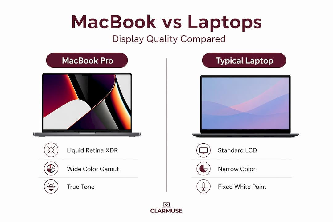
OLED panels from other manufacturers typically deliver deeper blacks than IPS LCD due to per-pixel lighting control. MacBook’s mini-LED approach narrows that gap significantly through thousands of dimming zones. Where MacBook pulls ahead consistently is in sustained brightness. Many OLED laptop panels throttle brightness to protect longevity, while the MacBook Pro sustains 1,000 nits without thermal penalties during typical use.
Users also perceive display quality through factors beyond brightness and contrast:
- Glare handling. Nano-texture glass controls reflections without the color penalty of standard matte screens.
- Color consistency. Factory calibration means the screen behaves predictably across different content types.
- Text rendering. High pixel density combined with macOS font rendering produces text that many users describe as printed quality.
- Adaptive color temperature. True Tone removes the subtle visual tension that comes from a screen that reads colder or warmer than the ambient environment.
Psychology research confirms that users perceive premium display quality not just from resolution numbers but from the combined effect of color accuracy, surface texture, and lack of glare. A MacBook display delivers on all three simultaneously, which is why the overall impression feels different even to people who are not consciously analyzing it.
Practical decisions for MacBook buyers and daily users
Understanding why MacBook displays attract attention is useful context. Translating that into buying decisions requires a more grounded view of how these features play out in daily use.
For most users, the standard Liquid Retina display on MacBook Air hits a level of quality that genuinely exceeds daily needs. The Liquid Retina XDR panel on MacBook Pro with mini-LED is worth the additional cost if you work in video editing, color grading, photo retouching, or any task where dynamic range and brightness matter practically. For writing, coding, and general productivity, both screens perform well.
Here are the factors worth working through before deciding:
- Nano-texture vs. standard glass. If you frequently work near windows or in variable lighting, nano-texture glass reduces visual fatigue noticeably. If you work in a dim, controlled environment, the standard glass delivers slightly more punch with no meaningful downside.
- Display scaling settings. macOS uses a “looks like” scaling system rather than native pixel mapping. The recommended HiDPI setting balances sharpness with comfortable UI size. Pushing to lower scaling increases screen real estate but softens text slightly. Choose based on your actual workflow, not just benchmark results.
- True Tone for comfort versus color precision. Leave True Tone on for general use. Turn it off when you need to evaluate color output for print or screen production work.
- In-store evaluation. Spec sheets do not capture texture. When evaluating a MacBook purchase, open a webpage with dense text, switch to a bright photo, then examine how the screen handles both. Pay attention to glare from the store’s overhead lighting. That hands-on impression reflects real-world performance more accurately than any number.
Pro Tip: When evaluating a MacBook screen in a store, ask a staff member to open a high-resolution photo alongside a standard white webpage. The transition between those two content types shows you how well the display handles dynamic range and maintains color in everyday conditions.
A screen that performs well on those real-world tests also happens to perform well in public spaces, cafés, and shared offices. And a screen that performs well in those environments is a screen that other people will see and notice. That leads to a practical consideration worth naming plainly: the better the screen, the more visible its content is to anyone nearby.
For practical tips on managing that visibility when you are working around others, Clarmuse’s guide on screen positioning for privacy covers real-world approaches that do not require any hardware.
My take on what actually makes MacBook screens different
I have spent a lot of time in front of different laptop screens, and the honest answer is that MacBook displays stand apart not because of any single specification. It is the integration. Apple’s hardware and software are tuned together in a way that makes the display feel deliberate rather than assembled from available parts.
What I find most underappreciated is True Tone. Most people assume they do not notice color temperature shifts, and they are right in one sense: they do not consciously notice them. But they notice when the screen feels uncomfortable and they are not sure why. True Tone removes that friction quietly. It is the kind of feature that earns loyalty without ever getting credit.
I also think expectations around displays have shifted significantly in the past four years. Users who came from standard 1080p laptop screens and moved to Retina often describe it the same way people describe switching from standard to high-definition television. The old resolution becomes difficult to tolerate once you have seen the improvement. That shift in baseline expectation is now driving a broader market toward higher pixel density, with MacBook having set that expectation years before the rest of the industry followed.
My practical advice: do not buy a MacBook solely for the display. But if you are comparing laptops at a similar price point and sitting down in front of both, the display will very likely be the thing that closes the decision. It earns that weight honestly.
— Gabriel
Protect what your MacBook display reveals
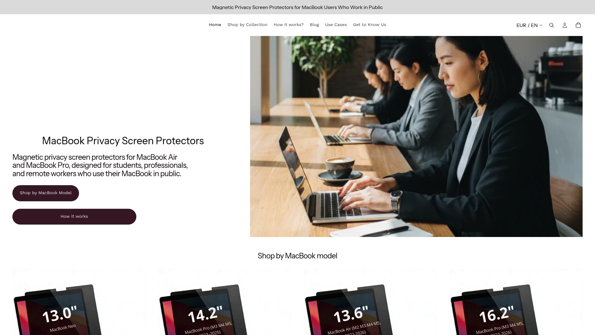
MacBook displays draw attention because they are genuinely worth looking at. That same quality means your screen is visible to others in cafés, coworking spaces, airports, and anywhere you work alongside people you do not know. Clarmuse makes magnetic privacy screen protectors designed specifically for MacBook Air and MacBook Pro models. They attach without adhesive, maintain display clarity at your direct viewing angle, and reduce what is visible from the side. No bulk, no complicated installation. If you work on a MacBook in shared spaces regularly, it is the most direct way to keep your work to yourself without changing how your screen looks to you. Browse the full range of MacBook Pro filters and find the fit for your model.
FAQ
What makes MacBook displays better than other laptop screens?
MacBook displays combine high pixel density, factory color calibration, wide color gamut support, and features like True Tone and nano-texture glass into a single package. Most competitors match one or two of those elements but not all together.
Is the nano-texture glass on MacBook Pro worth it?
Nano-texture glass is worth considering if you work in variable or bright lighting. It reduces glare without washing out colors, which is a practical improvement over standard matte coatings in real-world conditions.
Does True Tone affect color accuracy for professional work?
Yes. True Tone adjusts the display’s color temperature dynamically, which improves comfort but introduces variation. Disabling True Tone and automatic brightness is recommended when evaluating colors for print or screen production.
How does macOS scaling affect text sharpness on MacBook?
macOS uses a scaling system that renders the interface at higher resolution and then scales it to fit. The recommended HiDPI setting delivers the sharpest text for most users; lower scaling can soften the output slightly.
Why do MacBook screens stand out in public settings?
High brightness, accurate color, and low glare make MacBook screens visually prominent even in well-lit spaces. That visibility works in your favor for usability but also means your screen content is more readable to people around you.


